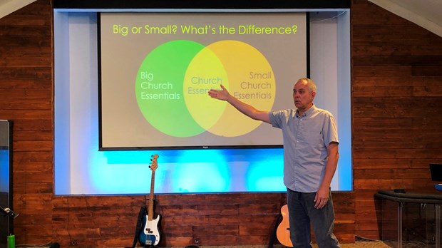
Are there any two words more likely to send an audience running for the exits than “PowerPoint presentation?”
That’s why, even though I use PowerPoint almost every time I speak, I don’t do PowerPoint presentations.
I teach. I preach. I talk. I illustrate. I tell stories.
And I use visuals on a screen to enhance that communication. The program I use to create those visuals happens to be PowerPoint.
Like any tool, it can be used well, or it can be used badly.
There are a few techniques that make PowerPoint work for me, and they all come down to a simple principle that every public speaker needs to acknowledge.
PowerPoint is designed to help the audience hear better, not to help the speaker communicate better.
Every mistake we make with PowerPoint happens because we violate that one principle.
PowerPoint is a tool, not a magic cure for boring speakers.
It won’t make you a good speaker if you don’t have the basics down.
Use it. Don’t let it use you.
Whenever I’ve seen a PowerPoint presentation turn an otherwise good communicator into a droning robot, that’s what’s happening. They’re relying more on the tool than they are on developing their communication skills. They’re more concerned with getting the slides right than how the audience is receiving what they’re saying.
So here are my 6 essential techniques to use PowerPoint to help people hear what’s being said.
1. Create A Presentation That Can Function Without PowerPoint
What happens if (when) your technology goes down? Can you deliver your message without PowerPoint? If not, you’re leaning on it too heavily.
Once your message can stand on its own, use PowerPoint to show an illustration that can’t be fully described in words, or to add a little “pop” and flavor. That’s what it’s designed to do.
2. Don’t Overload The Screen With Images Or Words
Use one image at a time. Maybe two if you need to contrast something.
And no more than three or four lines of large, readable text.
A crowded screen forces the audience to divert their attention away from what you’re saying to figure out what’s on the screen.
3. Stick With A Plain Background
There are so many fun background toys to use, from patterns to moving graphics. But when you’re speaking, the last thing you want is to have listeners be distracted by anything that isn’t central to your message. And, let’s face it, those visuals – and especially the motion backgrounds – aren’t central to the message.
They’re not enhancing, they’re distracting.
My go-to is always a dark background (usually flat black) with white lettering (yellow for titles). It’s clean, clear and it emphasizes the words in the clearest way.
The black background is especially helpful if the screen placement is right behind the speaker – that way it’s not too bright and distracting for the audience.
4. Use Simple – And Limited – Fonts
One of the first signs of an amateur presenter is the misuse of fonts. Especially the overuse of “fun” fonts.
“But,” you may argue, “there are so many fun fonts available!”
Yes, we know. We have them on our computers, too. They’re not that special.
The best presentations use one or two fonts (one for title, one for text) that are clear, simple and easy to read.
For the main body of your text, it’s best to use a simple san serif font like Arial, Tahoma or Helvetica. Serif fonts are designed for reading a lot of text, such as in a book or a magazine article. The simple, clean lines of a san serif font work best in on-screen presentations.
So why do they even make fun fonts if we’re not supposed to use them? It’s okay to use them, just use them very sparingly, no more than 5 or 6 words at a time, like in the title of your talk.
But even there, we should avoid overusing high concept fonts like Comic Sans, Papyrus and Impact. They scream “amateur”.
5. Decide On – And Stick With – Simple Transitions
Another sure sign of a novice is the overuse of transitions and animations – the way we add text and graphics to an existing slide, or move from one slide to another.
As with fonts, it’s best to land on a couple transitions, then use the same transition every time you make a similar change. This gives your presentation a consistent feel and it helps your listeners follow you.
For instance, I use a simple fade between slides that have the same background, and a fade-through-black on the rare occasion that I’m going between slides that either have a different background or different graphics. This gives the audience a short visual transition between images, instead of a jarring jump from one to the other.
Don’t fly in and out between slides, or use swirls, bounces, checkerboards and so on. They don’t help, they distract.
Animations within slides should be done the same way. Pick a couple simple animations and use them consistently.
For instance, I use a simple wipe from left to right when adding a new line of text within a slide (which feels similar to the way we write things down) and when adding a scripture verse or block quote I’ll fade the text onto the screen as a single item.
6. Don’t Read From The Screen
Whether you memorize your talk, read it from a script, use bullet points or speak extemporaneously is up to you.
But no speaker should ever simply repeat what’s on the screen.
The screen can show what you’re saying, but the audience should always feel that the screen is following you, not that you are following the screen.
You Are Your Best Communication Tool
To summarize, if this blog post was done as a spoken presentation (which it will be in the future), I would have one title that stays on the top of the screen, with six slides of san serif text on a black background. That’s it.
And I would present the talk looking directly out at the audience with only the ocassional glance back to explain a graphic or two.
The most powerful communication tool is not the image on the screen. It’s a speaker with passion, knowledge and an ability to speak directly to the audience.
A bad PowerPoint distracts from that. A good PowerPoint enforces it. But not even a great PowerPoint can make a bad talk into a good one, or a good one into a great one.
That’s up to you, your message, and your ability to connect with people.
Copyright © 2018 by the author or Christianity Today.
Click here to read our guidelines concerning reprint permissions.
Pivot is a part of CT's
Blog Forum. Support the work of CT.
Subscribe and get one year free.
The views of the blogger do not necessarily reflect those of Christianity Today.
Join in the conversation about this post on Facebook.
- A Discipleship Strategy Small Churches Can Actually Follow, with Darrell Stetler (Ep 38)Darrell and Karl talk about the importance of discipleship in the life of the church – and as a central role in our calling as pastors.
- Why Proximity and Longevity Matter in Pastoral Ministry, with Alan Briggs (Ep 36)Karl interviews Alan Briggs, a pastor, the author of Staying is the New Going, the host of the Right Side Up Leadership podcast and StayForth.com.
- Seculosity: Ministry In The Era Of Secular Religion, with David Zahl (Ep 37)Karl Vaters interviews David Zahl, author of Seculosity: How Career, Parenting, Technology, Food, Politics, and Romance Became Our New Religion and What to Do about It.
- Should You Start a Podcast? And Positive Ministry Trends, with Aron Utecht (Ep 35)Karl Vaters interviews Aron Utecht, a pastor and the host of the Good Ideas for Churches podcast


