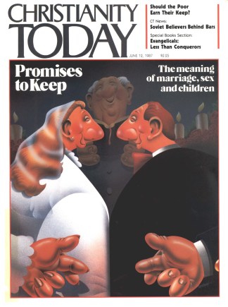
You will notice at the start of Bob and Elizabeth Roberts’s piece on page 16 a stylized, postage-stamp-sized rendering of two wedding rings. This “logo,” used here to tie together graphically our series of articles on marriage, sex, and children, is but the latest “sharp and simple” expression from designer/illustrator Dwight Walles.
“Keeping it simple is the key,” says Walles, who has been called upon by CT to capture the essence of such complicated subjects as universalism and the end times—all in an art form that will be reproduced in the magazine in approximately one square inch.
“Obviously the more abstract the topic, the more difficult it is to convey that topic graphically in one or two images.” Homosexual marriage (Nov. 22, 1985) was a case in point.
“That was a tough one,” remembers Walles. “A controversial topic. Troublesome images. I settled on the idea of using the two interlocking medical symbols for male, with the outline of a face barely visible within the overlapping circles. It’s one of my favorites.”
The medical symbols for both male and female also are significantly represented in Dwight’s most recent CT effort.
“Dealing with clichés is about as difficult as dealing with abstractions,” Walles says. “And wedding rings are a cliché of marriage. That’s why I decided to give each ring a shadow in the form of the male and female symbols. The overall image and three-dimensional feel are a bit offbeat, but immediately recognizable—and interesting to look at.”
In other words, Dwight is ready for the next stamp-sized challenge.
HAROLD SMITH, Managing Editor


