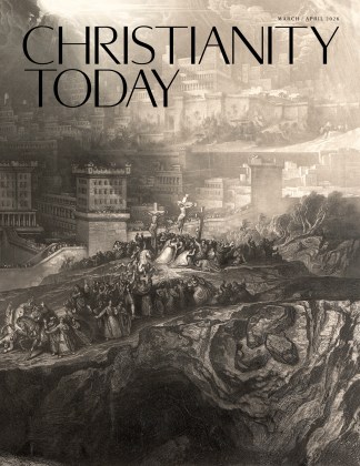
Christianity Today has changed a bit since the first issue was published in October 1956. The look is different. The feel is different. We’ve chosen a different font.
One of the first editors of Christianity Today noted (with a hint of despair) that no one cares about fonts. He wasn’t wrong. Design elements—the font, or the width of the margin, the quality of the printer’s ink, and a million other near-invisible things—are meant not to be noticed directly but to give the magazine a “feel.”
If you do notice, and dig in to the history of Christianity Today’s design, one constant becomes clear: The magazine has been carefully updated, adjusted, and redesigned, time and again, to fulfill the promise of Today. CT strives to speak to this present moment, and that means sometimes changing how things look. It means, sometimes, caring more than normal about fonts.
 Billy Graham has done it all, it seems. Carolina tent revivals. Football-stadium prayer meetings. He preached to more than a million people in a single sitting in Seoul, South Korea, beamed his crusades electronically with his Global Mission from Puerto Rico, and now he has appeals on the Internet promoting his meetings.But Graham, who turned 79 last month, did something different in his recent Bay Area campaign: He combined three crusades into one. Graham knitted together more than 1,400 churches from a metropolitan area that includes three of California’s largest cities.Graham’s typical pattern in recent years has been to preach five consecutive nights in one city. But this time, in the course of a month, he took his ministry first to San Jose, then to San Francisco, then to Oakland—circling the Bay to evangelize in cities that have distinct and competing cultures and whose churches rarely talk to one another.The campaign, which concluded October 26, was a logistical nightmare that required close to two years of planning. But it worked. About 250,000 people attended nine events, pastors talked about a historic bonding of Christians around the Bay, and Graham predicted a “spiritual awakening” for the region.UNCHURCHED TERRITORY: More than the geography challenged the Graham ministry. The Bay Area is hardly a notch in the Bible Belt. Churches in San Francisco average fewer than 100 members, and only 4 percent of city dwellers attend church, compared to 38 percent nationally. Graham, who last preached in San Francisco in 1958, called San Francisco the most challenging city he has faced. With a lower than usual number of churchgoers to help in the planning, Graham turned to the Internet for creative publicity, such as an ad that read, “50,000 sinners in one place and you don’t think you’ll have fun?”In San Francisco, with a large population of homosexuals, Graham issued an invitation “whatever your sexual orientation.” But at the crusade, he stressed that sex is intended for “a man and a woman who are married.”Graham called homosexuality wrong, but not chief among sins. “The Bible says the greatest sin is idolatry, worshiping things other than the true and living God.”He preached that sin is sin, that millions of people are empty inside, looking for answers and ultimate meaning, regardless of where they live. He said the gospel is relevant to the fast-paced and technologically obsessed Silicon Valley. He lectured on expanding galaxies and divine creations that dwarf the greatest achievements of high technology.BED REST ORDERED: The evangelist, who has Parkinson’s disease, walked slowly but looked fit, taking time between each leg of the crusade to rest. Because he experienced recurring back pain, doctors ordered him to spend five days in bed resting before finishing the campaign in Oakland. He lamented that Ruth Graham, his wife of 54 years, could not attend because of her own health problems. “This is the longest period we’ve ever been separated since we’ve been married,” he said.Following a 1995 crusade in nearby Sacramento (CT, Dec. 11, 1995, p. 62), several San Jose pastors asked Graham to return to their city, where he had last preached in 1981. In subsequent discussions, the crusade expanded to include the entire Bay Area—a mammoth organizational job. They put together a snowballing effort that drew from 103 denominations and ended with 17,000 people accepting Graham’s invitation to “come forward” and dedicate their lives to Jesus Christ.“There is sin in your hearts, and that’s why Jesus Christ came and died on that cross,” he told the audience. “For you.”The world’s most famous evangelist spoke to multiethnic, multigenerational crowds. Young people with nose rings pushed elders in wheelchairs to their seats, and there was a noticeably festive atmosphere.The crusade blended old and new and showed how much worship has changed since Graham emerged from the revivals of the South. His friend of more than 50 years, 88-year-old George Beverly Shea, dressed fastidiously and sang hymns with a 6,000-voice choir. But crusade organizers once again turned to Christian rock to help reach a younger generation.The largest—and most youthful—crowds came when Graham shared the stage with contemporary Christian musicians. At the San Jose Arena, which holds 18,000 people, a crowd of 32,500 overflowed into the outdoor parking lots and parks where singer Steven Curtis Chapman’s performance could be seen on 20-foot-high video screens. At the Cow Palace, outside San Francisco, an overflow crowd of more than 22,000 heard Jars of Clay. In Oakland, where Graham last preached in 1971, dc Talk and Michael W. Smith attracted 55,000.But the proceedings quickly focused on Jesus and Christian living whenever Graham took the pulpit, and the crowds moved from house-rocking songs to somber prayer.In San Jose, Graham spoke frankly to the young people about sexual temptations. “When I was in high school and the early years of college, I was tempted,” he said, “so much so that I did not think I could hold on. But I turned it over to the Lord. And I never touched a woman in the wrong way. … And the first time I ever had sex was the first night of my marriage.”The audience broke into applause. Then Graham offered his punch line. “And I can tell you one thing,” he said with a smile. “It was worth it.”SWAN SONG? Wherever Graham has traveled lately, audiences seemed aware that they might not ever see the aging evangelist again. When he took the pulpit in Oakland on October 26, the crusade’s final night, the crowd rose and applauded him.Moments later, Graham, whose messages have been unchanging through the years, asked, “What about you? Have you been cleansed by the blood?”In Oakland, Graham saw the highest percentage of response among young people in his 50-year ministry. Those ages 12 to 18 made up more than half the audience at four youth events and accounted for more than 60 percent of the salvation decisions.Graham has no plans to retire. He will conduct his next crusade in Ottawa, Ontario, Canada, in the spring.Copyright © 1997 Christianity Today. Click for reprint information.December 8, 1997 Vol. 41, No. 14, Page 68
1956 – Editor Carl F. H. Henry, planning the first issue of Christianity Today, complains that people think fonts are boring. The first issue uses Deepdene and Fairfield, which Henry considers modern typefaces.
1963 – CT’s first redesign is done by ad man Harvey Gabor, who will go on to direct the iconic commercial “I’d like to buy the world a Coke.” Gabor says CT requires something “intangible” and “a style and momentum all its own.”
1966 – CT prints its first image on the cover—a globe surrounded by flames, all in grayscale. Inside, the only editorial image is a cartoon. Later the same year, the magazine experiments with covers in color.
1976 – Color photos begin to appear semiregularly on CT covers. The 20th anniversary issue features Billy Graham in a yellow polo shirt. Inside, an editor examines the way evangelicals are “seizing the public imagination” in the “Year of the Evangelical.”
1978 – CT combines summer issues for economic reasons. Instead of four issues in July and August, there are now two. Circulation director Keith Stonehocker is credited with “maximizing growth while minimizing waste and inefficiencies.”
1983 – The nameplate—reading “Christianity Today” on the cover—is tweaked without any note in the magazine. Also, the periodical, which previously was published “fortnightly,” is now mailed out “semimonthly.”
1994 – CT’s layout and design are done on a desktop computer for the first time. Print articles are uploaded to the internet, making CT one of the first religious publications online.
2000 – The magazine is redesigned to improve the “flow” of content. The news section is moved to the beginning, and columnists Philip Yancey and Charles Colson are placed at the end. “I hope you recognized this magazine,” writes managing editor Michael G. Maudlin. “The changes are a little startling, I admit.”
2009 – Graphics are introduced to Christianity Today, and the sections are color-coded. An editor’s note from David Neff explains the concept: “Find that color—red, green, or yellow—running across the top of any page, and you’ll know what kind of material you’re about to read.”
2013 – CT starts printing “CT” on the cover. “We’ve started calling ourselves what everyone already calls us,” executive editor Andy Crouch says. He too tries to convince people that fonts are interesting: “We’ve adopted the glorious typefaces Periódico and Calibre.”
2024 – The issue you’re looking at now has a whole new look. Much of its inspiration was drawn from our 1960s era, particularly in the design of our new logo.


