
Centuries before Christians searched Scripture on illuminated digital screens, the Word of God was “lit up” with masterful calligraphy, colorful illustrations, and gold and silver filigree in the illuminated Bibles and manuscripts of the Middle Ages.
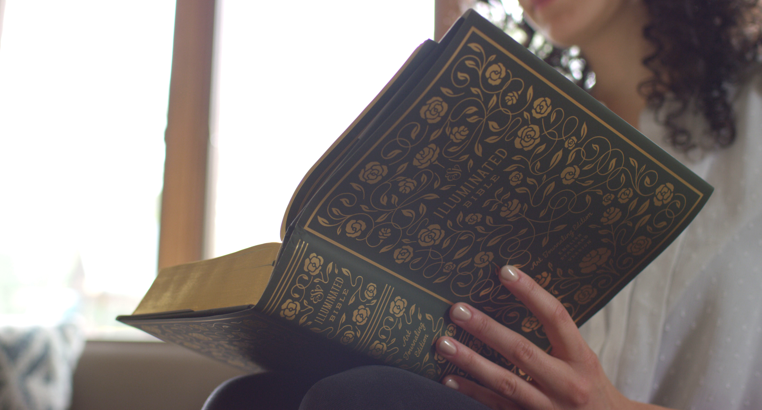
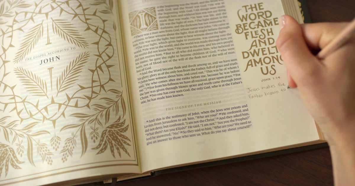
A new Bible edition from Crossway offers contemporary readers a glimpse of that classic style in an English Standard Version (ESV) Bible glimmering with hundreds of hand-drawn gold illustrations.
Christian designer Dana Tanamachi, nationally renowned for her chalk art and lettering work, spent seven months creating full-page illustrations for each book of the Bible and served as art director for the project, which follows Crossway’s launch of a multi-volume reader’s Bible in 2016 and a single-column journaling Bible in 2014.
“I’m not aware of anything else quite like the ESV Illuminated Bible,” J. Mark Bertrand, a Bible design expert who runs the blog Lectio, told CT. “Maybe because the ESV Illuminated Bible is a mass market effort, maybe because of the clear influence of the ‘Bible journaling’ trend—which the ESV Journaling Bible helped create—it feels like something unique.”
Even with the growth of Bible sites and apps, around 80 percent of Bible readers—and about as many millennial readers—still prefer to study a physical text. New Bible designs and formats aim to make it easier and more engaging for today’s readers to get into the Word.
“Our prayer is that the added ornamentation and illustrations will draw the readers’ eyes to the beauty of the Word of God itself,” Crossway writes in the ESV Illuminated Bible.
Several more recent efforts to bring the historic practice of illumination to 21st-century eyes have been designed for galleries and museums, not the Christian bookstore. Almost two decades ago, calligraphers and artists set out to create the Saint John’s Bible, the first handwritten, illuminated Bible in 500 years.
 Courtesy of Crossway
In 2011, Crossway debuted a manuscript of the Gospels featuring abstract paintings and illuminated capitals by artist Makoto Fujimura; the works—as well as the materials Fujimura used to create them—are now on display in the recently opened Museum of the Bible in Washington.
Tanamachi had everyday readers in mind as she studied and designed in her Seattle studio, hoping the book—filled with 500 illustrations and lettered verses—would become an heirloom for families. (The price point is $40–$50.)
“It’s very much steeped in history and tradition, but for the modern eye,” the 32-year-old said, pulling inspiration from art nouveau, the arts and crafts movement, and designers like William Morris and Koloman Moser.
CT’s Kate Shellnutt interviewed Tanamachi and Crossway’s senior vice president of creative, Josh Dennis, about the art and design featured in the new Bible.
How familiar were each of you with illuminated Bibles? What was your impression of that kind of presentation prior to this project?
Dana Tanamachi: It was something we briefly studied in our history of graphic design. I was familiar with the Book of Kells [a ninth-century illuminated Gospel manuscript], super colorful and very dense. I think that’s the only one I knew by name. I’ve always felt like they were almost otherworldly, kind of hard to believe that something like this actually exists in reality, knowing that they were created 100 percent by hand, not on a computer or on a printing press. From afar I have had the utmost respect and reverence for these books and their creators.
Josh Dennis: Working in Bible publishing and knowing how much work goes into producing each edition of a printed Bible, it’s remarkable to think that Bibles and other books were at one time only produced in this way. Our Bible manufacturer sometimes says that each Bible we produce is a small miracle, knowing all of the people and steps involved from typesetting and designs, selecting materials and manufacturing. So many things need to come together to create a Bible. How much more amazing is it that all of this used to be done by hand. The amount of craftsmanship and skill required is remarkable.
 Courtesy of Crossway
Most people think of illuminated Bibles as historical objects. How do you create an illuminated Bible to be used in the present?
Tanamachi: When I think of an illuminated Bible, I think of something really precious that’s like behind glass or is on display at a museum or in a collector’s archive somewhere. [When] the original illuminated Bibles were being produced, they were for the wealthy and powerful who could commission them. There’s always been these sacred objects that don’t necessarily end up in the hands of the people for them to enjoy and explore. With this particular ESV Illuminated Bible, we wanted to create something that was just so to-the-brim with inspired art, something that could be opened hundreds of times and still discover something new. … It’s really hard to do in today’s digital age where we’re always off to the next thing that catches our attention.
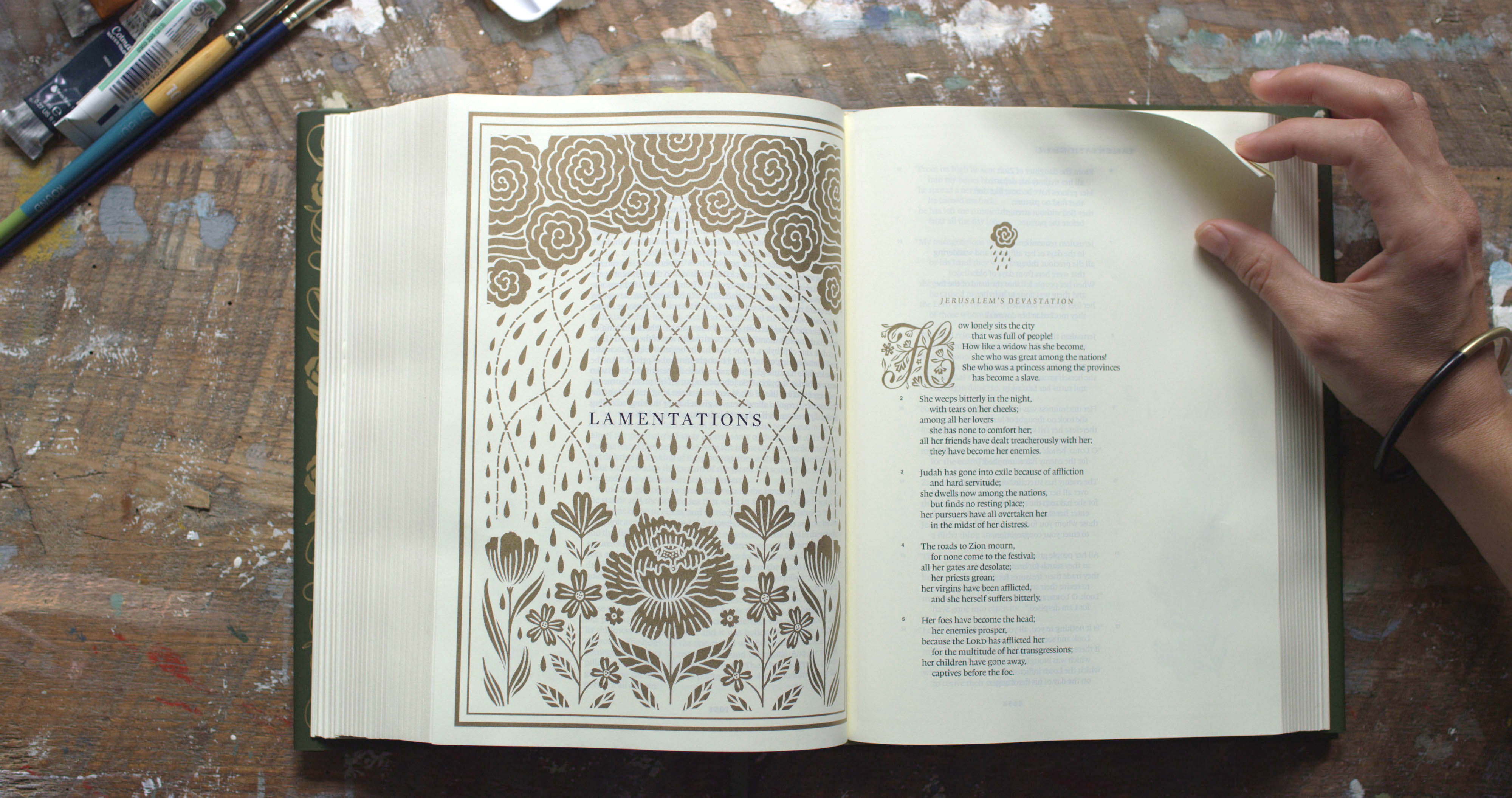
When I think of the original illuminated Bibles, I think of very dense art that takes up the whole page and the margins. For this edition we really want people to engage with it, so there’s a lot of negative space and wide margins for people to write in it and to do their own Bible journaling.
You use a lot of classic symbols and images, but, like you said, there’s a lot of breathing room that gives it a modern feel.
Dennis: There’s been kind of a revival in recent years with typography, and sites like Instagram and others have allowed for that and encouraged artists to share their work, making it accessible to anyone. Because of how ubiquitous design has become, there’s been a renewed interest in things that are made by hand, requiring skill and craftsmanship.
Dana is so well trained and has such a love and appreciation for historic and vintage typography, which has kind of made her ideal for this project. We wanted to retain some of the traditional elements of the illuminated manuscript. Traditionally, monks and skilled scribes and artisans would use gold-foiled gilding and illustration and lettering and drop caps in their design. We knew that we wanted the artwork to be drawn by hand and that it was important to use gold metallic ink and even gold foil. We wanted this Bible to be connected to the tradition, but we also wanted to use modern methods so that we could pull it off.
 Courtesy of Crossway
How does this project relate to the rest of your work at Crossway?
Dennis: In a lot of ways, it’s kind of like the culmination of everything that we have learned in Bible printing and production. We have a really amazing Bible production and design team that worked hard to make this Bible happen. I don’t think it’s something we could have done ten years ago or even five years ago. It’s fun take a step back, now that the Bible has been published and is in print, and just to reflect on how it came together.
Dana, how this did this process compare to other projects you’ve taken on? So much of your work has been for secular clients and audiences.
Tanamachi: Obviously, there is the sacred aspect of it. It is the Bible, so it is people of faith who read it; it’s something for them. That said, I think people can appreciate the art even if they aren’t a person of faith.
The main difference to me was the sheer size of the project. I might work on a magazine spread or a book cover that takes a couple of days, or a mural, some type of installation over in a few weeks or a month. To work on something this massive and spread out time-wise was really new. This project took seven months, so it was the only project I worked on for most of this year. I felt really entrenched in it. It felt like part research project, part design challenge.
Also, it was imperative to keep in mind this is something that people are going to be spending a lot of time with. They’re going to be reading, relating, mulling over, meditating on it, and I wanted this Bible to be a gift that keeps on giving. A lot of what I typically create, like I said, magazine spreads, book covers, packaging, it often takes more of a passable place in someone’s life. They may encounter it, but they’re just walking by it or it’s on their bookshelf or they may read it once.
I bet it’s a good feeling as a designer to know that people are actually going to notice and appreciate all the details.
Tanamachi: It was Josh’s idea, in the end, to put an art index in the back. We spent so much time on all this art, and he didn’t want it to get lost in translation. He said, “I want people to understand the symbolism and the kind of overarching themes of every book opener illustration.”
When you flip to the back and you see all the thumbnails of all the book opener illustrations, it has a little blurb that tells you what each one is about. I love that people can understand it even on a deeper level. Hopefully, it will help them in their journey through the Scriptures. If they’re visual learners, that’s a goldmine.
Do you have a favorite illustration?
Tanamachi: I change it all the time. Right now two favorites are probably Ruth and Revelation. The book opener illustration for Ruth looks pretty simple but actually was one of the most challenging for me. Wheat is one of the main pieces of imagery in the story. She loses her husband. She follows Naomi back to her homeland. She meets Boaz. She gleans in his field. And in chapter two, Boaz commends Ruth her loyalty and says, “The God under whose wings she has come to take refuge will reward her.” I love that imagery of wings, wingspan, the comfort and protection that that offers, but also I wanted to incorporate the wheat into it as well. Being able to combine those two symbols into kind of one image I think is really powerful.
Revelation is another favorite because it was the last one that I did, and so I was really almost creatively spent. There were ups and downs in this project for sure. Sometimes it was really meditative and thrilling, and at other times it was grueling. As it all came together, it’s one of my favorites with all the symbols in there. It feels more serious and solid and reverent. There’s a lot of ink on the page, so it just feels like such a great bookend. I wanted to represent Revelation, but how do you do this in an elegant way without being too scary or too fantastical? To me, this is kind of gateway door with all the symbols in the composition.
And what about you, Josh?
Dennis: My three favorites are Job, Lamentations, and Ezekiel. They’re kind of like all in the same genre a little bit for me. I love the subtlety. I was talking about restraint in each illustration, and then just the thoughtfulness and symbolic nature of the artwork, really, to interpret the text in a consistent and profound way. From the beginning, Dana and I both decided that we didn’t want to try to interpret the text literally, but instead, Dana selected more symbolic imagery. Because of that, each illustration is almost layered, and it takes some understanding of each book of the Bible. It doesn’t have the same impact or effect that traditional Sunday school art would have on the viewer where it’s kind of like, “Oh, that’s Noah and the ark. I’ve seen that before.”
 Courtesy of Crossway
What do you think God taught you through this project, and how has it changed the way you approach Scripture?
Dennis: I have a high view of Scripture. We wanted to treat it with the greatest care and respect. God loves beauty, so we wanted to honor him through this project with something that was beautiful. But I think the project taught me a lot of other things, even like acting in faith when you don’t know exactly what the end result is going to be.
Tanamachi: The project taught me perseverance. Some days, [the work] does come really naturally, and you feel like it’s very inspired and meditative and God gives you a very clear idea. Then there are the days where life happens. You have things going on. But you continue to show up. I would move on [if creativity stalled on an illustration], and I could leave it there in faith. It will come when it comes—and it would.
As far as my view of Scripture, I mentioned earlier that there are visual learners, and I’m one of them. For me to be working on the art for each of these books, it definitely gave me a better understanding of the overarching themes in each of the books of the Bible. Now when someone’s referencing Ezra or Nehemiah or something, I can recall those illustrations and have a better understanding of the role that each book places in the grander narrative. As a visual learner, there was a lot of giving in this project, but there was also a lot of receiving. It’s kind of cheesy, but things do become illuminated as you’re so deep into something like this. It would be really hard to walk away and not be affected by it.
How does the illuminated text affect the reader’s experience?
Dennis: There’s so many nerdy details in there and things I’ve learned about design and typography, like “Why do the attributes of the typeface that we chose for the text make it easier for the Bible reader to read?” Another one would be line matching, so each of the lines on one side [of the paper] are matched up with the lines on the reverse side. It’s a simple thing, but it took us time to learn to do that, and it allows for better show through. Even like the opacity of the paper, that was something that we went back and forth on.
As we’ve been doing Bible publishing, just like with anything, you learn and you get better at your craft. We’ve done surveys and paid attention to the marketplace. We also wanted to create something that [readers] may not have known that they did want, but just something beautiful and new.
Tanamachi: What I really appreciate is that [the Crossway designers] are really good at taking away all the distractions. [They] are really good at restraint. Nothing is pulling away from the main thing. It was great to be able to do a project this where there’s so much heart, but also their years of expertise on the Bible design side just allowed the art to really shine. They provided the perfect canvas for hundreds of illustrations to have a home.